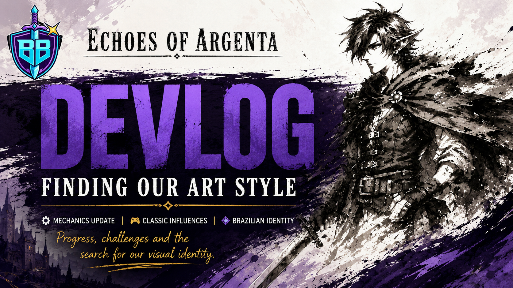
Echoes of Argenta Devlog: Finding the Art Style Behind the Adventure
This Echoes of Argenta devlog is about a strange but important moment in development: many of the game’s core mechanics are finally taking shape, but the visual identity is still being questioned, challenged, and rebuilt in conversation.
That may sound backwards at first. Usually, people imagine a game starting with a clear look, a clean mockup, a perfect screenshot, and then mechanics being attached later. For us, the process has been messier, more personal, and probably more honest.
We have already completed large parts of the gameplay systems we wanted for Echoes of Argenta. The game has a stronger mechanical foundation now. But the art style still needs a final decision, and our goal is to define that direction by the end of this month.
Editorial note: this devlog does not include affiliate links. It focuses on the development process, creative direction, and design decisions behind Echoes of Argenta.
What Is This Echoes of Argenta Devlog About?
This devlog is about the moment where mechanics and identity begin to meet.
The practical answer is simple: we have finished major parts of the mechanics, but we are still debating the game’s art direction. The deeper answer is more complicated. We do not want the visuals of Echoes of Argenta to feel like a costume placed over the game after the systems are done. We want the style to feel like it belongs to the same hands, memories, influences, and instincts that shaped the project in the first place.
That means honoring classic influences without simply imitating them. It also means bringing our own Brazilian sensibility into the game, not as decoration, but as part of the creative DNA.
The Mechanics Are Becoming Solid, But the Visual Identity Still Needs Its Shape
A large part of game development is learning that progress does not always happen in a straight line.
Some systems become clear early. Others resist definition. In Echoes of Argenta, the mechanical side of the game has reached a point where we can feel the structure becoming more stable. Movement, interaction, progression, and the general rhythm of play are no longer just abstract ideas. They are becoming things we can test, adjust, and judge with more confidence.
The art direction, however, is still in that dangerous and exciting zone where every choice changes the emotional tone of the game.
A line can make the world feel nostalgic or modern. A color palette can make a scene feel mysterious, warm, distant, or playful. Character proportions can decide whether the player reads the game as mythic, intimate, cartoonish, strange, or grounded. These decisions are not cosmetic. They affect how the player understands the game before a single line of dialogue appears.
Why the Art Style Matters So Much in Echoes of Argenta
The art style of Echoes of Argenta needs to do more than look good in screenshots. It needs to support the kind of experience we are building.
When a game is inspired by classics, the easiest mistake is to copy the surface: the resolution, the camera angle, the color limitations, the UI framing, or the familiar silhouette of older adventure games. But classic games are not memorable only because of their visual restrictions. They are memorable because their limitations forced strong decisions.
That is the part we want to respect.
- Classic influence should guide discipline, readability, atmosphere, and strong silhouettes.
- Our own drawing style should bring personality, imperfection, rhythm, and emotional texture.
- Brazilian identity should appear naturally through shapes, visual instincts, humor, warmth, contrast, and cultural memory.
- The final look should feel handcrafted, not assembled from references.
That balance is not easy. It may be more work. But sometimes the harder road is the one that gives a game its own face.
Honoring Classic Influences Without Becoming a Copy
We grew up with games that left strong visual memories. Some of those memories were technical: limited palettes, chunky sprites, expressive UI, simple animation cycles, and bold readable shapes. Others were emotional: the feeling of entering a strange world, recognizing a character from a tiny silhouette, or imagining details the screen could not fully show.
The challenge is that nostalgia can easily become a trap.
If Echoes of Argenta only tries to look like something old, it risks becoming a memory of another game instead of becoming itself. The point is not to reproduce the past exactly. The point is to understand what made those games work and then use that understanding to build something personal.
| Creative Direction | What We Want to Preserve | What We Want to Avoid |
|---|---|---|
| Classic inspiration | Readable shapes, strong atmosphere, memorable visual rules, clear feedback. | Empty nostalgia or copying a retro look without purpose. |
| Personal drawing style | The feeling of human-made lines, expressive proportions, and artistic personality. | A polished but anonymous style that could belong to any project. |
| Brazilian identity | Local creative instincts, cultural flavor, warmth, contrast, humor, and visual rhythm. | Using identity as a superficial theme instead of letting it shape the art naturally. |
| Production reality | A style we can sustain across characters, environments, UI, animation, and future content. | Choosing a beautiful direction that becomes impossible to maintain. |
Bringing Brazilianness Into the Game Without Turning It Into a Gimmick
When we talk about bringing our Brazilian identity into Echoes of Argenta, we are not talking about placing obvious symbols everywhere and calling it representation.
For us, brazilianness can be quieter and more interesting than that. It can appear in how characters carry themselves, in how colors collide, in the humor of a pose, in the handmade irregularity of a shape, in the emotional warmth of a scene, or in the way fantasy feels less sterile and more alive.
Brazilian creativity often grows from mixture: different influences, improvised solutions, personal memory, popular art, animation, comics, street-level visual culture, and the simple habit of making something with what you have. That instinct matters to us.
We do not want Echoes of Argenta to look Brazilian because it checks a box. We want it to feel connected to the way we learned to see, draw, play, and imagine.
The Childhood Drawing Problem: Why Personal Style Is Hard to Protect
There is a specific memory behind this decision: when we were kids, we drew in our own way.
Of course we had influences. Everyone does. Games, cartoons, comics, anime, toys, packaging, magazines, old menus, strange manuals, character art, box covers, and whatever else was around us. But we did not process those influences cleanly. We misunderstood things. We exaggerated details. We copied badly, then accidentally created something that felt more like us.
Over time, those early drawings became separate styles with visible influences but different instincts.
That is the feeling we want to bring into Echoes of Argenta: not a perfect imitation of the classics, but the strange personal result of loving those classics for years and then drawing from memory, taste, and experience.
The goal is not to ask, “What old game should this look like?” The better question is, “What did those games teach us, and what do our hands do with that influence now?”
The Common Misunderstanding About Indie Game Art Direction
A common misunderstanding is that indie game art direction is mainly about choosing a style that looks attractive.
That is only part of it. For a small team, art direction is also a production decision, a readability decision, a branding decision, and a design decision. A style can be beautiful in one illustration but fail when it needs to support hundreds of animations, UI states, environmental assets, combat feedback, and repeated gameplay situations.
That is why we are being careful.
- The style must be expressive, but not so complex that every asset becomes a bottleneck.
- The characters must feel personal, but still readable during gameplay.
- The world must have atmosphere, but the player still needs to understand paths, threats, objects, and interaction points.
- The classic influence must be visible, but the game cannot become a museum piece.
Good art direction does not only answer “What does the game look like?” It answers “How does the game communicate?”
How the Art Style Connects to Game Design
Because the mechanics of Echoes of Argenta are already becoming more defined, we can now judge the art style against real gameplay needs instead of pure mood boards.
That matters. A character design that looks great in isolation may not work during movement. A background that feels atmospheric may fight against important gameplay information. A UI element may look stylish but slow down player understanding. A color palette may feel beautiful in a still image and confusing after ten minutes of play.
The more the mechanics mature, the clearer these questions become:
- Can the player understand what is interactive?
- Do characters remain readable in motion?
- Does the environment support exploration instead of hiding important information?
- Does the visual tone match the rhythm of the mechanics?
- Can the style scale across the full game without losing quality?
This is where the art stops being only an aesthetic question. It becomes part of how the game plays.
What We Are Deciding This Month
Our goal for this month is to move from open debate into a clearer visual direction.
That does not mean every asset will be final. It means we need to define the rules of the style well enough that future decisions become easier. A strong art direction gives the team a shared language. It helps us know when something belongs in the game and when it only looks interesting on its own.
| Decision Area | Why It Matters |
|---|---|
| Character proportions | They define personality, animation style, emotional tone, and readability. |
| Line and shape language | They decide whether the game feels clean, rough, playful, nostalgic, strange, or handmade. |
| Color direction | Color controls mood, visual hierarchy, environmental identity, and player focus. |
| UI treatment | The interface needs to feel connected to the world without getting in the player’s way. |
| Animation workload | The style must be expressive enough to feel alive but realistic enough for production. |
Broken Build Perspective: A Game’s Style Should Remember Where It Came From
The most interesting part of this phase is realizing that art direction is also memory management.
Every developer carries a private archive of images: games played too young, characters copied into notebooks, menus remembered incorrectly, colors from old screens, drawings made before technique caught up with imagination. Those things do not disappear. They become part of the way a creator solves problems.
For Echoes of Argenta, we want to let that archive speak without letting it control everything. The game should show its influences, but it should also show the distance between who we were as kids drawing for fun and who we are now trying to build a complete game.
That tension is useful. It keeps the project from becoming too polished, too generic, or too afraid of personality.
Why Taking the Harder Visual Route May Be Worth It
A more personal style usually costs more effort.
It can be harder to standardize. It can require more testing. It can create disagreements because the target is not always obvious. A generic style is easier to explain because everyone has already seen it before. A personal style has to prove itself through iteration.
But that extra work can give the game something valuable: a visual identity that does not feel interchangeable.
When players remember a game, they often remember how it felt to exist inside its world. Mechanics create part of that feeling. Music, pacing, writing, and feedback create more of it. But the art style is usually the first handshake. It tells the player what kind of world they are entering.
For Echoes of Argenta, we want that handshake to feel familiar enough to invite players in, but personal enough to make them stay curious.
FAQ
What is Echoes of Argenta?
Echoes of Argenta is a game currently in development by Broken Build Games. This devlog focuses on the project’s mechanics, art direction, classic inspirations, and the search for a stronger visual identity.
Are the mechanics of Echoes of Argenta already finished?
Large parts of the mechanics have been completed, but development is still ongoing. The current focus is not only making systems work, but making sure the game’s visual identity supports those systems properly.
Why is the art style still being debated?
The team wants the art style to honor classic influences while still feeling personal, Brazilian, and connected to the developers’ own drawing instincts. That kind of decision takes more care than simply choosing a familiar retro look.
Will Echoes of Argenta have a retro art style?
The game is influenced by classics, but the goal is not to copy an old style directly. The visual direction is being shaped around readability, personality, Brazilian creative identity, and the needs of the gameplay.
Why does Brazilian identity matter to the game’s art direction?
Because the team wants the game to reflect the way they learned to draw, imagine, and interpret influences. Brazilian identity can appear through visual rhythm, warmth, contrast, humor, shapes, and cultural memory without becoming superficial decoration.
What This Reveals About Echoes of Argenta
This stage of development says a lot about what we want Echoes of Argenta to become.
We do not want a game that simply borrows the language of classics. We want a game that understands why those classics mattered to us, then transforms that influence through our own background, our own sketches, our own production limits, and our own sense of style.
The mechanics are giving the project a body. Now the art direction needs to give it a face.
If you are following the development of Echoes of Argenta, this is one of the most important creative decisions so far. Not because it creates a finished screenshot, but because it defines how the game will be remembered, recognized, and felt.
More devlogs will come as the visual direction becomes clearer and the world of Argenta starts to show more of its final shape.